Relocating Families: London’s Safest Boroughs, and How to Check the Street Yourself
Safety advice for relocating families: which London areas are safest and how to check any street yourself, with five pre-offer checks and a NoFooly street...
In this guide
- Table of Contents
- Safest areas of London: the annotated shortlist worth inspecting first
- Step-by-step checks before you view or offer on a property
- Weighing safety against price, commute and amenities
- How a pre-purchase area report reads safety and other local risks
- Public transport safety and getting home after dark
- Community engagement and how much neighbourhood watch actually helps
- Why school reputation and area safety usually move together
- How safety trends have shifted and where they’re heading
- Author perspective: what I’d actually ask before offering on a place
- Get a street-level verdict before you offer
- Sources
Richmond upon Thames, Sutton, Harrow, Kingston upon Thames and Merton consistently rank as London’s safest boroughs on crime-per-resident figures. Families chasing space and school catchments do best in Richmond, Sutton or Kingston; commuters and value seekers should look at Merton, Bexley or Bromley for lower prices without a big safety trade-off. None of that replaces checking ward-level data and walking the actual street before you offer.
TL;DR:
- Crime rates fluctuate significantly within boroughs, so checking specific ward and street data over multiple months provides a clearer safety picture.
- Outer boroughs like Sutton and Bexley offer lower prices and fewer incidents but involve longer commutes and less nightlife activity.
- Safety investments such as CCTV and hotspot policing are actively improving specific areas, often before borough-wide figures reflect the change.
- The presence of active residents’ associations and neighborhood watch schemes correlates with lower long-term crime and better community responsiveness.
- For accurate safety assessments, combine borough data with a person-checked area report and your own after-dark walk before making property offers.
Table of Contents
- Safest areas of London: the annotated shortlist worth inspecting first
- Step-by-step checks before you view or offer on a property
- Weighing safety against price, commute and amenities
- How a pre-purchase area report reads safety and other local risks
- Public transport safety and getting home after dark
- Community engagement and how much neighbourhood watch actually helps
- Why school reputation and area safety usually move together
- How safety trends have shifted and where they’re heading
- Author perspective: what I’d actually ask before offering on a place
- Get a street-level verdict before you offer
- Sources
Safest areas of London: the annotated shortlist worth inspecting first
Borough tables are the starting point, not the answer. Here’s what the numbers and the character of each place actually mean for someone deciding where to view flats or make an offer.
- Richmond upon Thames. Consistently the benchmark for low crime in London, with figures around 57 to 60 crimes per 1,000 residents in recent analyses. Riverside walks, strong schools, and a village feel in Barnes and Kew. The catch is price. Richmond is one of the most expensive boroughs in the capital, and Heathrow flight paths clip parts of the borough.
- Sutton. Quietly one of the safer outer boroughs, with far less of the tourist footfall and nightlife density that drives incident numbers up elsewhere. Good for families on tighter budgets who still want decent primary schools and a manageable commute into Victoria or London Bridge.
- Harrow. Strong community ties across a genuinely diverse population, and crime figures that sit well below the London average. Housing stock leans toward semis and 1930s suburbia rather than period conversions, which suits growing families more than young professionals wanting a buzzy high street.
- Kingston upon Thames. Combines relatively low crime with an actual town centre: shops, a market, riverside pubs. It attracts commuters who want somewhere to live rather than just sleep, and the schools are a genuine draw for relocating families.
- Merton. Wimbledon sits inside this borough, and the contrast between Wimbledon Village’s safety profile and parts of Mitcham further east shows exactly why borough averages can mislead. Check the specific postcode, not just the council name.
- Bexley and Bromley. The budget-conscious picks. Both post safety figures competitive with the boroughs above at noticeably lower price points, though you trade some of the transport speed and cultural amenity that inner boroughs offer.
- Hampstead and quieter pockets of Wimbledon. Centralism locations that buck the usual “safe means far out” pattern, largely thanks to affluence, low footfall after dark, and heavy investment in local upkeep. You pay a serious premium for that quiet.
Step-by-step checks before you view or offer on a property
Run through these five steps for any specific address before you get emotionally attached to it.
- Search Police.uk for the exact ward. Look at the last 12 months of incidents and note whether the trend is rising, falling, or flat.
- Cross-check the London Datastore and the local council’s dashboard for antisocial behaviour and repeat nuisance reports that don’t always show up in headline crime figures.
- Visit at two different times of day. Daytime viewings hide a lot. Walk the same street after dark and check lighting, sightlines, and whether entry systems look secure.
- Talk to neighbours or a local shopkeeper. Ask directly whether incidents cluster around one address or spread evenly. A repeat problem at a single property is a stronger warning sign than scattered one-off offences.
- Order an area report when the stakes are high enough. For anything beyond a casual look, a NoFooly area report (from £9; from £29 read by a named person against your own brief) checks crime data alongside flood risk, nuisance sites, and planning applications for that postcode.
Weighing safety against price, commute and amenities
The lowest crime figures in London cluster in boroughs that also carry some of the highest property prices, and that correlation isn’t a coincidence. Richmond and Wimbledon post excellent safety numbers and command premiums that price out plenty of buyers who’d happily live there otherwise.
Flight paths, longer commutes and thinner high streets are the usual price you pay for chasing the very bottom of the crime tables in outer boroughs. A family prioritising school catchments and garden space might happily trade twenty extra minutes on the train for a safer, quieter street in Sutton or Bromley. A young professional wanting nightlife and a fifteen-minute commute may find that trade unworkable and look instead at well-connected mid-price areas.
- Families: weight schools and green space heavily, accept a longer commute for the right catchment.
- Young professionals: prioritise transport links and evening activity, and treat safety data alongside walkability after dark.
- Investors: look for boroughs with improving crime trends rather than already-low figures, since that’s where value tends to shift.
How a pre-purchase area report reads safety and other local risks
Public dashboards give you the raw numbers. A NoFooly Foolproof report does the interpretation: crime against the national benchmark for the postcode, flood risk and recorded floods, noise, nuisance sites like sewage works, and planning applications that could change the area’s character, all pulled from official data for England and Wales.
On the £29 tier a named person reads the report against your own brief and deal-breakers, catching an anomaly in the figures or a planning application buried in council paperwork. It reads the area, not the building, and it ends in a plain-English verdict, not a spreadsheet.
Public transport safety and getting home after dark
Safety data on paper doesn’t tell you how a station feels at 11pm, and that gap matters more than most buyers realise. Richmond, Kingston and Wimbledon all benefit from well-lit, well-used stations with regular staff presence into the evening, which changes the lived experience of a commute regardless of what the crime figures say.
Overground and Underground stations in the safer outer boroughs tend to have lower footfall after dark than Zone 1 interchanges, which cuts both ways. Fewer people around can mean fewer witnesses if something does happen, but it also means far less of the pickpocketing and opportunistic theft that thrives in crowded central stations. Night bus routes fill genuine gaps in Harrow and Sutton, where the last train can be earlier than commuters expect.
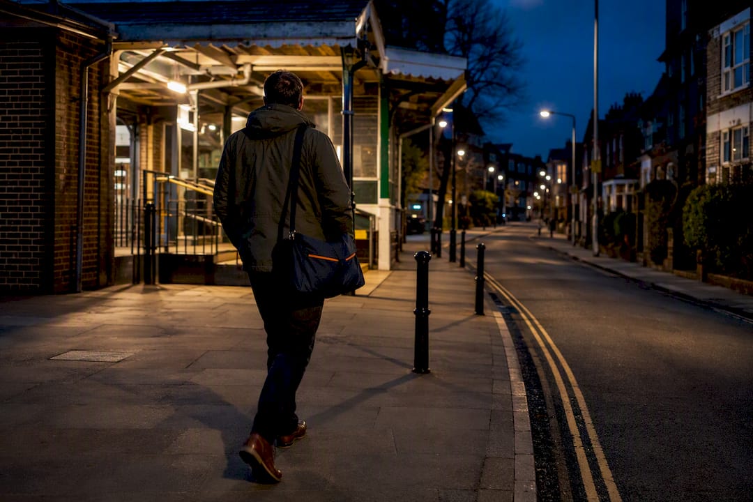
Walk the route from station to front door, not just the station itself. A five-minute walk down a well-lit residential road feels entirely different to the same five minutes along an underpass or an unlit stretch of industrial estate, and that’s precisely the kind of detail borough-level crime tables cannot capture. Check whether your specific route is covered by decent street lighting and whether it passes anywhere with a known cluster of incidents on Police.uk. Ask current residents, if you get the chance during a viewing, what the walk actually feels like once the sun’s gone down.
Community engagement and how much neighbourhood watch actually helps
Neighbourhood watch schemes and residents’ associations tend to correlate with lower long-term crime trends, though the relationship runs both ways. Engaged communities report issues faster, which improves policing response, and areas that already feel safer attract the kind of residents willing to volunteer for a watch scheme in the first place.
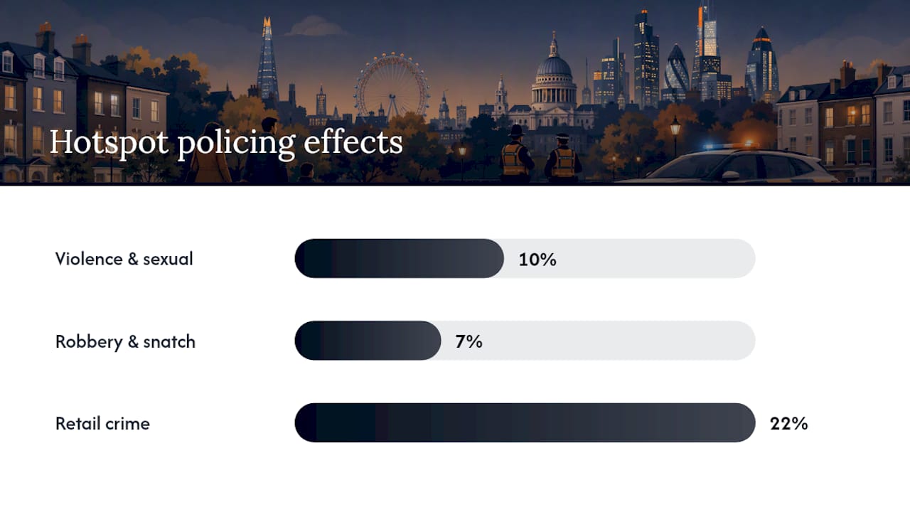
Richmond, Kingston and pockets of Merton have particularly active residents’ associations that do more than organise the odd street party. Many liaise directly with local policing teams, flag recurring antisocial behaviour before it escalates, and push councils on lighting or maintenance issues that affect how safe a street feels. That kind of organised pressure is part of why the City of London’s targeted hotspot policing has produced measurable results: violence and sexual offences down 10%, personal robbery and snatch theft down 7%, and retail crime down 22% in identified hotspots to February 2026. Community reporting feeds the same intelligence that makes hotspot policing effective in the first place.
Ask an estate agent or seller directly whether there’s an active residents’ group for the street, not just the borough. A functioning WhatsApp group or community patrol scheme is a genuine, if unofficial, safety signal that no dataset records.
Why school reputation and area safety usually move together
Strong schools and low crime rates tend to travel as a pair, and the relationship isn’t a coincidence. Families gravitate toward catchments with good Ofsted ratings, and that demand pushes up demand for the surrounding streets, which in turn funds better lighting, more community investment, and lower tolerance for antisocial behaviour.
Richmond, Kingston and Sutton all benefit from this loop. Their strongest primary and secondary schools sit in some of each borough’s quietest residential pockets, and estate agents in these areas will happily tell you which streets fall inside a sought-after catchment because it’s a genuine selling point. The reverse holds too: a borough with patchy school performance often overlaps with wards carrying higher antisocial behaviour figures, though that’s a correlation worth checking street by street rather than assuming borough-wide.
Don’t rely on a school’s overall reputation alone. Check the specific catchment boundary against the exact address you’re considering, since catchment areas shift year to year and a fantastic school two streets away is no use if you’re outside its current boundary. Cross-reference that against the same ward’s Police.uk figures rather than treating “good school nearby” as a proxy for a safe street in its own right.
How safety trends have shifted and where they’re heading
London’s overall crime trajectory has moved unevenly across boroughs over the past decade, with outer boroughs like Richmond, Sutton and Kingston holding relatively stable, low rates while some inner boroughs have seen sharper swings tied to nightlife density and transient population. That stability is itself a signal worth weighing: a borough with a flat, low trend line is a safer long-term bet than one that dipped low in a single good year.
Targeted policing investment is the biggest driver of near-term change to watch. The City of London’s hotspot approach shows what focused CCTV and patrol investment can do to falling retail and street crime figures in specific problem areas, and similar micro-targeted schemes are spreading to other boroughs as councils see the results. If a borough announces new hotspot policing or CCTV investment in a specific ward, that’s often an early signal of improving figures over the following year or two, well before it shows up in the annual borough-wide averages.
Regeneration projects cut both ways. New transport links and housing developments can lift an area’s profile and bring investment that improves safety over time, but the disruption during construction, plus a temporary influx of transient workers, sometimes shows up as a short-term bump in minor crime figures. Treat a single bad year in an otherwise improving ward as noise rather than a reason to rule the area out, and always check the multi-year trend line on Police.uk rather than the most recent twelve months in isolation.
Author perspective: what I’d actually ask before offering on a place
Borough tables are useful for ruling places out, not for ruling one in. The gap between a good headline number and a street that actually feels safe at 9pm is where most buyers get caught out, and it’s the gap public data simply isn’t built to close.
If I were viewing, I’d ask the seller or agent two things directly: has anything been reported on this street in the last twelve months that wouldn’t show on a headline crime figure, and is there an active residents’ group or watch scheme covering this specific block? Answers, or the lack of them, tell you more than any borough ranking.
— Wayne
Get a street-level verdict before you offer
Borough tables and Police.uk maps get you close, but they stop at the ward. A NoFooly Foolproof report goes to the postcode: crime data, flood risk and recorded floods, noise, nuisance sites, and planning applications, and from £29 it is read by a named person rather than left as a raw spreadsheet dump.
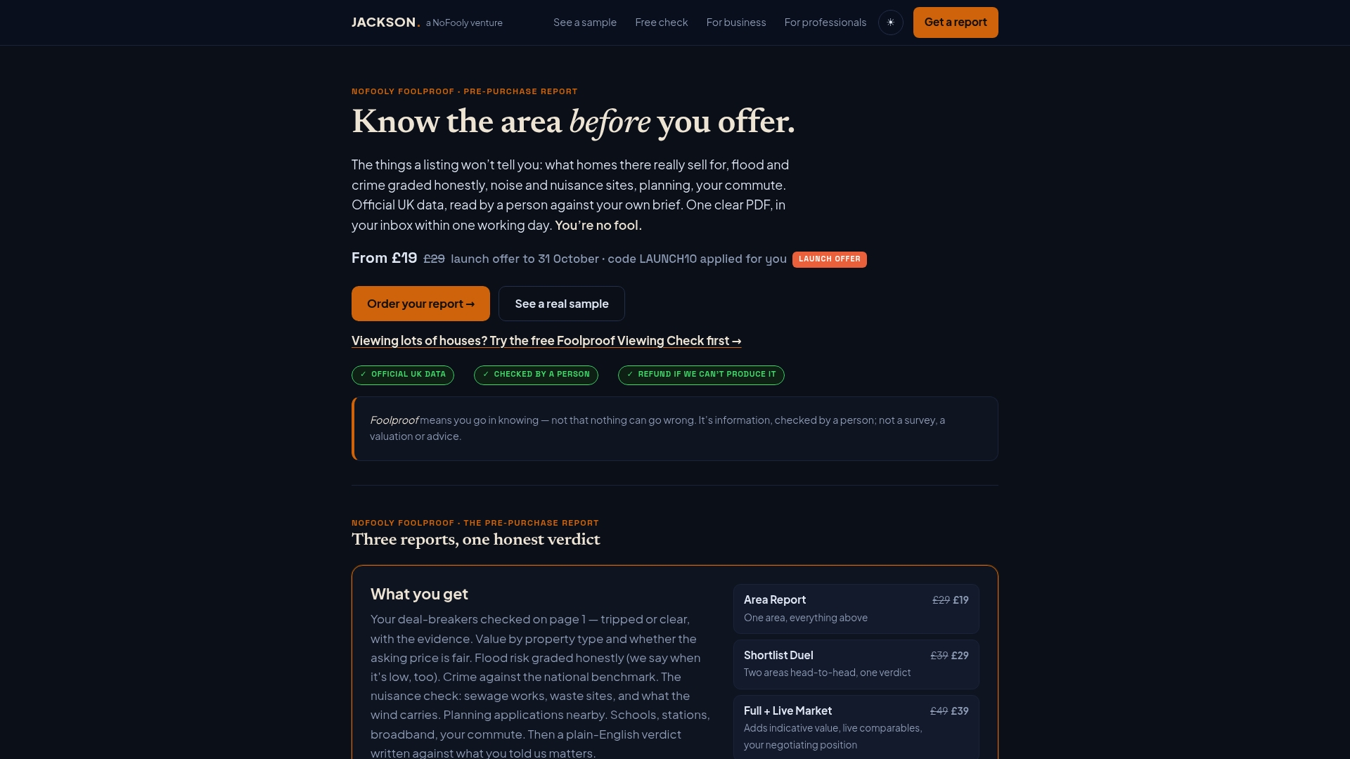
On the person-checked tier the verdict is written against your own brief and deal-breakers, so you get a plain-English read on the postcode you’re actually considering, not the borough average. That matters most in exactly the boroughs covered here, where Merton’s Wimbledon Village and its Mitcham streets, or Richmond’s riverside pockets against its flight-path fringes, can carry very different safety profiles under one council name. Before you make an offer on a specific property, get the NoFooly Foolproof report for that postcode and go in knowing what the area looks like. It is an area report, not a survey, and it covers England and Wales only.
This article is general information, not advice. Crime figures are public data that change month to month; check the current numbers yourself before acting on anything here.
Sources
Every credible safety comparison starts with crimes per 1,000 residents, a rate that lets you compare a borough of 90,000 people fairly against one of 300,000. Raw incident counts without that adjustment are close to meaningless.
The category split matters just as much as the headline number. A borough with high theft but low violent crime feels very different to live in than one with the reverse, even if the overall rate looks similar on a table. Always check the breakdown between violent crime and acquisitive crime (theft, burglary, vehicle offences) rather than trusting one blended figure.
Three things worth checking before you trust any “safest borough” list:
- London’s Safest Areas to Live: A Data-Driven Guide | Essential Living
- Police reveal how ‘spidey sense’ and CCTV are cutting crime in the Square Mile | IanVisits
Pro Tip: Pull up the same ward on Police three times: last month, six months ago, and a year ago. A ward trending down matters more than one that’s simply low right now.
For the raw data, three sources do the heavy lifting: Police.uk for street-level incident maps and monthly figures, the London Datastore for borough and ward statistics you can cross-reference, and Metropolitan Police or City of London Police reports for context on local initiatives. Academic work on hotspot policing confirms that a small share of streets generate a disproportionate share of incidents, which is exactly why street-level checking beats borough averages every time.
Short on time? Let us run the checks for you
Viewing this weekend and don't fancy an afternoon of maps? The free Foolproof Viewing Check pulls the headline tiles for any address you're looking at — no card, no sign-up.
Want the whole area read by hand and written up, checked and signed off by a real person before it reaches you? That's the Jackson pre-purchase area report. Software does the legwork so it's quick and affordable; a person makes the call so you can trust it. Reports start from £29.